Saturday, 14 April 2012

Research: Band Shots

For my preliminary task I think it is important to take still shots of the band and the individual musicians. I have drawn on Tom Ang's professional photography tips and applied them where necessary. Taking good photos with the right light and positioning is very important as I am planning to base the poster on one overlying image of the band, so the shot needs to be effective in terms of mise-en-scene and other important areas. A link to his tips on the BBC website can be found here: http://www.bbc.co.uk/arts/apictureofbritain/how_to/

Additionally i found some not to dos and important things to keep in mind for the shots:

Avoid red eye. Red-eye is caused when your eyes dilate in lower lighting. When your pupils are big, the flash actually lights up the blood vessels on the back wall of your eyeball, which is why it looks red. If you must use a flash in poor light, try to get the person to not look directly at the camera, or consider using a "bounce flash". Aiming your flash above the heads of your subjects, especially if the walls surrounding are light, will keep red-eye out. If you don't have a separate flash gun which is adjustable in this way, use the red-eye reduction feature of your camera if available - it flashes a couple of times before opening the shutter, which causes your subject's pupils to contract, thus minimizing red-eye. Better yet, don't take photographs which require a flash to be used; find somewhere with better lighting.

Focus. Poor focusing is one of the most common ways that photographs are ruined. Use the automatic focus of your camera, if you have it; usually, this is done by half-pressing the shutter button. Use the "macro" mode of your camera for very close-up shots. Don't focus manually unless your auto-focus is having issues; as with metering, automatic focus usually does a far better job of focusing than you can.]
Try an interesting angle. Instead of shooting the object straight on, try looking down to the object, or crouching and looking up. Pick an angle that shows maximum color and minimum shadow. To make things appear longer or taller, a low angle can help. If you want a bold photo, it is best to be even with the object. You may also want to make the object look smaller or make it look like you're hovering over; to get the effect you should put the camera above the object. An uncommon angle makes for a more interesting shot.

Fill the frame with your subject. Don't be afraid to get closer to your subject. On the other hand, if you're using a digital camera with plenty of megapixels to spare, you can crop it later in software.

Compose your shot thoughtfully. Get rid of distracting backgrounds and clutter. If this means you and your friend have to move a little so that a tree does not appear to be growing out of her head, then do so. If glare is coming off the windows of the house across the street, change your angle a bit to avoid it. If you're taking vacation photographs, take a moment to get your family to put down all the junk they may be carrying around with them and to remove backpacks or hip packs as well. Keep that mess well out of the frame of the picture, and you will end up with much nicer, less cluttered photos. If you can blur the background in a portrait, then do so. And so on.

Monday, 19 March 2012

Creation of Digipak Advertisement

For the second goal of my preliminary task, I have chosen to produce a magazine advertisment for the previosly created Digipak. This post is intended to show in detail the proccess and decision taken during the creation proccess of the advertisement.

Throughout this task, I continually compared my own product and its progress with the research and analysis sections of my project. Trying to employ as many techniques as possible to help  make the adveritsement achieve its goal and fit the correct target audience. As the band and therfore design of the digipak is based around the genre of post-hardcore, I tried to follow the idea of 'edited realisim' to create cohesion between the digipak and the genre also.

For the first step of my magazine cover I wanted to ensure I retained every possible similarity to an original digipak or album advertisment, so i ensured the measurements for my working canvas fitted the size of other real advertisements. The majority I found (especially of this particullar genre) although scarce were A5 size, taking up half of a designated advert page. I found the correct mesaurements for these from www.papersizes.org and set the canvas using the canvas size tool on Photoshop. I continued using photoshop as it would allow me to work very closely from my finished album cover and sides and the advert itself. I was able to to do this using the tabs at the top of the program to switch between the two and copy and paste elements to the advert. This was very important for succesfull cohesion, esepcially colour schemes and caligraphy.


Friday, 16 March 2012

Creation of Digipak

For my A2 Preliminarry task I am going to show the proccess taken to produce my digpak cover including four sides to fit a standard jewel case. Showing the method used when producing this is important as it will help me to adjust and re-design certain elements of it. Additionally it will be a great tool for analysis as I can see the seperate stages that I have taken to produce the product and where I could of changed it to produce something better.


I decided to lay out four seperate 347mm x 355mm Photoshop blank canvas as a base for my four sides. I researched the measurements for a standard jewelcase bar the trim so that they would fit in a case after, and so that I knew what images and shapes I could fit within the canvas before


Before I even added any images or effects to the start the appearance of my digipak cover I decided to choose one and then complete it before moving on to the next side. I chose to do the cover first, as the cover controls what the rest of the digipak looks like in some respects as the theme and colour scheme should continue throughout. I knew from my analysis and research of Digipaks that multiple layers are often used and can help making the digipak have depth and colour.  I set out a variety of layers, with the enabled tool to add more if necessary later. I started with a 'Background' and one additional layer, with copy ability so I could copy the layer as many times as I wanted to produce a new additional and individual layer once edited.


Next I added a brown background which I found from google images, I used the scale tool to fit it within the canvas and then added a saturation effect, boosting 20%, giving the brown a nicer distinguished look as a backgorund, knowing images could fall into the colour almost as a ghostly outline.


After this was complete I added my first image into 'Layer 1'. This was taken from a camera during our music video shoot and was simply pasted and sclaed into the layer, infront of the background. With this image in position I applied a filter using the filters toolbar, and selected the area immediately around the image to fade in transparncy, as well as setting the overall transparency of the image to 50% to make it fade into the image. Once this was complete I used the 'Magic Wand' tool to select the left side of the image and paste with a much lower transparceny, creating the effect of the head splitting apart from the other head, looking in a different direction due to the rotation. Additionally the collar split seperately as I had to reselect this and copy the above for this section of the image.


Next I copied the previous layer and deleted the images within it, keeping the same colour and transparency settings I added another image, this time of an existing A Day To Remember artist, so that the album cover corresponds to the band themselves. Aswell as my interpretation of the meaning of the album name and the album itself from the 1st layer. I then scaled and moved the image to the empty space of the layer, where only the background was currently showing due to the positioning of layer 1. I decreased the transparceny to 8%, ensuring the image on the right with is ambient glow was the focus of the cover.


Lastly I spent some time matching rounded, and crisped font for the appropriate text to fit the chic and simple look of the cover.


My next choice was to start on the blank canvas for the back of my jewel case. I wanted to make the back cover look much of a real photography opposed the front cover, and gradually become more realistic throughout the pages of the digipak. I thought setting both ends would be a good idea as I knew what changes and the dgeree of changes I would have to make, when making the other pages.


I began by creating 2 layers as before, and setting the background as an image taken from www.obscurewallpapers.com with a life like rain effect applied, as well as great bright lighting which is helpfull to help the transparency of images apparent. I scaled this image, moving it so that the brighest light of the image was on the right, allowing it to highlight images being place either side, especially with a transparceny of under 30%. Next I added another image of the lead singer of the band, corresponding to the previous image used in the front cover (another common device used in album covers, where there is cohesion throughout the digipak and especially between the front and back covers, often having front and back shots of the same scenario, telling a story in many respects.) The back cover itself, I felt at the time needed more range of colours, closer to the cover as the look is completely different so my aim of what I wanted to achieve with this had to be clear. I added some charcoal effects to the background image using the preset photoshop fillers, but decided on removing them as the shadows did not show, which I think adds realisim to the shot. I increased the transparceny on his line on the left of the page, helping to highlight the image and the dynamic of the cover itself.
Once this was complete, I move to the 'middle page' in between the two previously created sides. I thought this would be a good place to insert the lyrics of the song, which is often included within many digipaks. I removed all three previous layers and started a new blank canvas, with a white background. I wanted to keep the cohesion throughout so an image of the same lead singer was necessary, however I decided do this by using a whole band shot, with the centre image being t he lead singer. This makes the reference to the previous and future pages but shows the necessary contirbutors and imagdes that need to be shown for an accurate representation of the band. I kept the mise-en-scene corresponding with the genre, with dark colours and reflecting lights onto the bodies of the images. I used a 'spotlight' filter to add the 'staged' look to the photo where the light shines from the top right inwards, despite being in a dark scenario at night. The lyrics come across the entire image, so that they can be read easily and are brought to the attention of the reader. I inserted the 'Monument' text at the bottom right, adding further cohesion and creating the sense of moonlight/green lighting for the image.


My last page that I created was the 'Inside Cover' page which I think combies many of the previous elements employed. Using layers I added a darkened image of a desolate area of woods, matching the genre oncemore, with the metalcore/post-hardcore genre. I applied a luminouzs filter to the closest section of the image, making the image now become more of a centered image opposed to just plainly a background image. The information on this page is not of huge importance, as the basic necessities had already been input. I thought however the credit to band members for our music shoot could be included here, as this is seen similiarly in other album inserts and jewel cases. Additionally i played around with the transparency of the cover, removing certain sections using the selection tool and then customizeing their transparency, attempting to make the top half of the image appear further away or faded compared to the rest. This was not as effective as I had hoped and decided to reduce the entire image's transparceny by 5%, aiming to keep the realisim of the image apparent.

In general, I focused on the cohesion of the images, and kept in mind that the images where designed to come together as part of a digipak, so therefore this was an important factor in the prodcution. When making them my choices primarily revolved around this opposed to what I personally felt looked good. My research and planning prooved helpfull in my understanding of the genre and product conventions and made my decision making much more straightforward than without.

Tuesday, 6 March 2012

Location Selection (Ancillary)

My colleagues and I have been thinking recently about where we should film our music video, how many different scenarios and all the other variables regarding location, such as mise-en-scene, fitting the genre and does it reflect the characters or work with the story. On a quick drive around our immediate area we decided to check out some of the locations that could work for a shoot of our music video, keeping in mind different areas can be great for different sections, even if they are only on or two seconds in the final piece. Below you can find a list of some popular locations among our group:

Before the list is shown I thought I would add this quote from Dan Lucas, which really reflects my view on the location for a music video "Pick somehwere that means something to you, that is relevant to your music. I recently saw Gummo and Buffalo 66, two outstanding films that were both shot by directors in the places they grew up. They were both deeply connected to their environments, they understood their surroundings, and they could see the odd and subtle beauty in each scene making them extremely personal and moving films. I'm not saying you have to go out there and become the next Harmony Korine, but just think about what you're trying to say in the locations you choose. Resist the temptation to shoot in your dad's garage just because it's easy and free."

Poole Park
Poole Park is an urban park adjacent to Poole Harbour in Poole, Dorset, England. The park was opened during the Victorian era and has remained popular with visitors ever since. It is open all year round and hosts a number of events. It is likely to be a great spot for areas of the story shoot as it fits nicely with the mise-en-scene being urban, youthfull artchitecture and relevance like a underpass with lighting and graffiti. The lights at night provide an interesting shot additionally.

Canford Heath
Canford Heath is a suburb and area of heathland in Poole, Dorset with a population of just under 14,500.

Canford Heath has also given its name to a housing development built on the heathland during the 1960s, 1970s and 1980s. Now an established part of Poole, Canford Heath has grown its own community life with two public houses (The Haymoor & The Pilot), a selection of churches, two supermarkets (Asda and Somerfield), five schools and a range of social activities for young people. The Tower Park leisure complex is nearby.

Monday, 27 February 2012

Poster Analysis 2 (Genre)

Social Distortion

Social Distortion is an American punk rock band formed in 1978 in Fullerton, California. The band currently consists of Mike Ness (vocals, guitars), Jonny Wickersham (guitars), Brent Harding (bass), and David Hidalgo, Jr. (drums).

Social Distortion temporarily disbanded in 1985 due to frontman Ness' drug addiction and troubles with the law which resulted in extended stints in various rehabilitation centers that lasted for two years. However, the band reformed around 1986 and have continued being active today, even after the death of longtime guitarist Dennis Danell, who succumbed to a brain aneurysm in 2000. Since its inception, the band lineup has been a virtual revolving-door of talent with many members coming and going – Ness has been the only constant member.
To date, Social Distortion has released seven full-length studio albums, two compilations, one live album, and two DVDs. The band released its debut album, Mommy's Little Monster, in 1983. Social Distortion did not release their second album, Prison Bound, until 1988 which attracted the attention of Epic Records who signed the band in 1989.
In 1990, Social Distortion released its highly successful self-titled third album which peaked at #128 on the US Billboard 200 and featured their well-known hit singles, "Ball and Chain", "Story of My Life", and the cover of Johnny Cash's "Ring of Fire." The next three albums, Somewhere Between Heaven and Hell, White Light, White Heat, White Trash, and Sex, Love and Rock 'n' Roll as well as the Greatest Hits compilation album which spawned the previously unreleased hit, "Far Behind"), were also well-received.
Social Distortion's most recent studio album is 2011's Hard Times and Nursery Rhymes which entered the Billboard 200 at #4 marking the group's highest entry on that chart. According to Ness, an eighth studio album is currently in the works which will likely be released in 2013.

Digipak Analysis 2 (Genre)

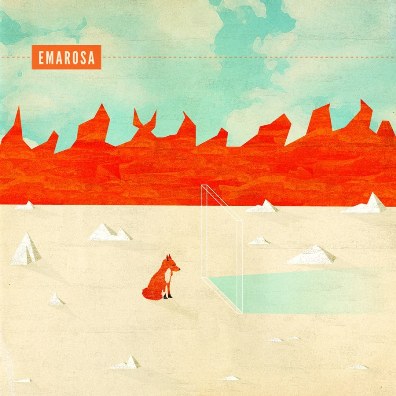
Emarosa - Emarosa
Emarosa informed fans that they had begun recording material for their new album via their YouTube channel. and on January 2, 2010 Emarosa entered the studio to record their second full length album working with producer Brian McTernan who had contacted Emarosa previously with plans to record their second album. While recording the band posted updates for fans from the studio which can be seen on their Tumblr blog.

The album was released on June 29, 2010 through Rise Records and received a good amount of praise. In an interview with Punktastic, the band spoke about the overall sound of this album. "I remember during the recording process, ER and I talked a lot about wanting to do more folk/indie stuff for the next record. Really bare bones, mellow and raw." Shrednews said "Emarosa have taken this album to a higher level, with more complex and animated guitar riffs, and pounding drum beats that you will make you headbang without even realizing it."
Craig stated that the band would be traveling to Portland after his solo tour to record a B-side for the self-titled album. He also stated that a version of "The Game Played Right" featuring Modsun would be released in.

While on tour, the band is known to occasionally play "Casablanca" with a guest vocalist. So far Cody Anderson (formerly of In Fear and Faith), Chris Roetter (of Like Moths to Flames, formerly Emarosa and Agraceful, who actually wrote the song), Austin Carlile, Jon Mess (of Dance Gavin Dance), Kyle Tamosaitis (formerly of Burden of a Day), Chris Moore, and Jerry Roush have performed this song alongside the band.

During the summer of 2010 Jonny Craig and Jon Mess both rejoined Dance Gavin Dance (of which they were original members). Although Craig had not announced his plans for his relationship with Emarosa, he is currently concentrating on his work with Dance Gavin Dance whose new album Downtown Battle Mountain II was released March 8, 2011. In Craig's absence Emarosa picked up ex-Tides of Man touring vocalist, Tilian Pearson. On February 27, 2011 Alternative Press broke the news that Craig had turned himself into detox, stemming from reports of Twitter scams and from a longtime addiction.

On April 11, 2011, Alternative Press announced that Craig had been kicked out of Emarosa. The band stated that "as of today, Jonny Craig is no longer a member of Emarosa. This decision has been a hard one to make, but we feel it is in the best interest for the band going forward." Tides of Man vocalist, Tilian Pearson is currently a touring member for the band filling in for Craig. According to an Alternative Press interview with the band, their ideal vocalist would not be like Craig tone wise. "We’re not looking for Jonny Craig 2.0. We just want to find someone who can bring something unique to the band," states Stewart.

Film Equipment

When planning the shoot for our music video, carefull consideration into what equipment should be used at what parts of the video was taken. My approach was to bring as much as possible and if at the end of the day it was not needd it doesn't matter. Better to be safe than sorry. When planning which equipment to bring, I matched our list of planned shots and went through each section invisioning the shot in my head and thought very carefully about logistic problems such as obtaining a smooth trracking shot without being able to obtain a proper dolly. To overcome this I suggested the idea that was to use my skateboard along with my friends skateboard and place the tripod on top for a 'make-shift' trolley to roll the camera across. The results prooved effective, supplying us with a nice smooth shot!

Below is a list of proffessional equipment used within music videos as well as our own and alternates:

  • 1080P Sony Digital Camera
The SonyHD-50 1080p Digital Camera, was supplied by our school and was able to capture high definition film, which when tested worked perfectly for our film which was inteded to be rendered at 480p high definition for the best quality with our back up camera. Clearly it was not within our budget for the music video to purchase a top quality film camera, but this was more than acceptable for our shoot giving decent quality despite some trouble with continuity due to lighting changes.

  • Camera Tripod
For our camera tripod we once more stuck with the supplied equipment from our school's media department, which I poersonally was more than pleased with. I as the designa ted filmer for the band shoot quickly got the grasps with how to handle it and adjust its height, angle and loosenes for panning and other active shots. The main trick with this was how to use this in combination with other pieces of equipment such as a height drama stage box, allowing us to get a crane view over the band. This helped a lot when looking at the finished product as there were not hand-held produced shakes in places where there are not meant to be. 


  • Backup Camera
We definitely need an alternative if the world of technology decided to fail on us during our shoot, as we only had one or two potential attempts at getting the shoot done due to our actor's schedules in the future. We kept a camera with the same definition to the previous used, relying on lighting and small tweaks to be performed on Adobe Premier after.


  • External Microphone
An external microphone is something many people decide to bring for capturing sounds within the video itself, however within our planning of the video we had not decided to use any of these sounds as the sound is being played from a seperate track over our video and we had worked hard on ensuring clean syncing with it. Addiitonally an external microphone of sufficient quality was hard to pick up at our level, if we did decide to use extrnal recordings of sound, our current film camera was more than acceptable.