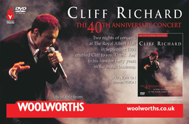
 Just from looking at a dozen or so examples, it is clear that the described preliminary task can be tackled in various manners, as the way digipacks or (albums) are advertised do not always solely revolve around this particullar product. For instance the 'Cliff Richard 40th Anniversary Concert' advertisement shows an upcoming sow of his whilst at the same time announcing his venues, times and duration of his live show.
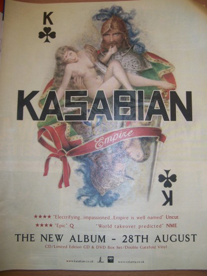 Digipack advertisements, do still appear within magazines such as 'Mojo' 'Kerrang' 'Word' and other mainstream music magazines, but the digipack itself is not shown to its full extent, this is left for the customer to see once they have purchased the album. Often the advertisement is published before the release date of the album itself to gather 'hype' and attraction to the album, depending on the scale and popularity of the artist.
 A common trait within the previously analysed packs, is that the album artwork is shown, clearly. Often the advertisement itself revolves around the portrayal of the artwork, catching the readers eye or not. The attraction of the band is second to the visual stimulation.
This brings me to my second note, being that the background and surrounding space on the standard A4 page (or in many cases A5 spread) along with another similiar advertisement or article is very important in the attention of readers as well as the feel of the advert. Whitespace is thought of very carefully, along with all other aspects defying the genre of the piece.
No comments:
Post a Comment